Brand Transformation
Clarke & Son: & then Son.
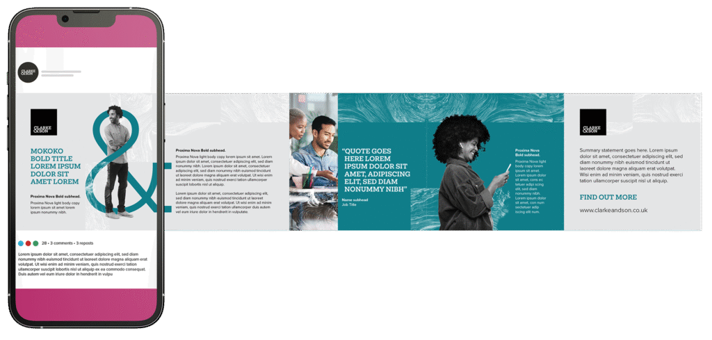
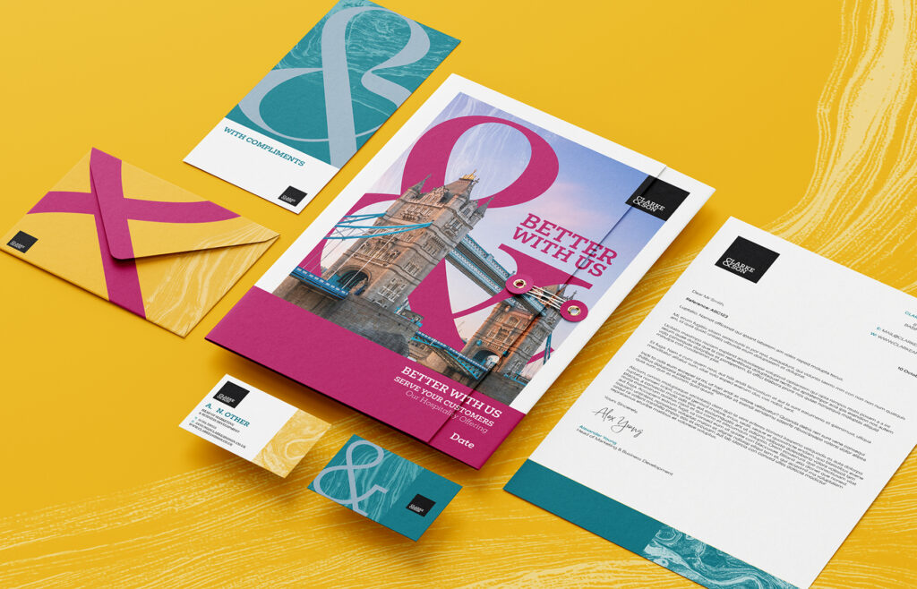
Clarke & Son approached us to update their current logo. We worked with them to create what became more of a brand transformation – updating their logo, adding a more iconic use of an Ampersand – to visually represent how Clarke & Son works with people or within industries, both in their logo and imagery.
The use of bolder, stronger colours to help them stand out from their competitors, the use of abstract textures and patterns; a tagline Better with us – which filtered down to their individual departments and complemented the & – along with a stronger sense of photography, has given Clarke & Son an edge in a competitive marketplace.

Established in 1862 Clarke & Son is a law firm with a long established reputation for the quality of advice and service to its clients. A leading full service firm of solicitors and legal experts looking after the legal needs of clients throughout Basingstoke, Hampshire, London and beyond.